Checking Image Registration

Visually checking your image registration - in other words, the overlap between images aligned in a common space - is one of the staples of any FMRI analysis pipeline. Sadly, although everyone says that you should do it, not many people go through the trouble of looking of visually inspecting image overlap; even though, in my opinion, I think that checking your image registration is one of the sexiest things you can do. "Sexier than brushing your teeth at least once a week?" Not quite, but we gettin' there!


Example of faulty image registration. Each set of orthogonal views represents a single subject's mask after first-level analysis. The orthogonal views highlighted with the yellow rectangle has suffered - terribly - from an error in image registration during preprocessing, which should be inspected further before doing a higher-level analysis.
In order to increase your attractiveness, I've written up a brief script - possibly my masterpiece - which will allow you to easily check the registration of a specified image. For example, you may want to check the masks for a group of subjects to make sure that they overlap, as a single mask which is far different from the others will lead to a truncated group mask. While not necessarily unsexy, missteps like these will only lead to average attractiveness. In other words, there's not anything really wrong with you, and there might be plenty of people who would settle for you, but...meh.


More details, including a demonstration of the script in action, can be seen in the following video.


John's Gems #5: Mesh Plots of T-Maps

For those of us who wish to act like we know more than we actually do, John Ashburner has a webpage of useful code snippets that allow you to do cool - maybe even useful - operations on your data. By using these gems, others may start to think that you are also cool - and maybe even useful.

Here I merely replicate John's Gem #5: Mesh Plots of T-maps. (Because coming up with something original on my own would be, like, you know, difficult.) While I cannot immediately think of a practical utility for this function, it does provide an interesting visualization of t-statistics as viewed through a transverse slice of the brain, as shown in the following figures:

Left: Transverse slice of a T-map seen from above. Right: Same image viewed at an angle. Note that the "hotter" spots are raised above the yellow plane threshold representing a t-score of 0, while "colder" spots deflect below the plane.

I recommend checking out more of the code snippets, as they provide insight into how the professional neuroimaging programmers approach problems. By immersing yourself within their thoughts, it will have a salutary effect on your thoughts as well, cleansing your muddled mind and training you to become focused, forceful, and direct. At least, that's what I think might happen.


SPM Tutorial 1: The Basics

As the majority of neuroimagers use SPM for data analysis, I have begun on another set of introductory tutorials geared toward the beginning SPM user. SPM is what is used in my lab (despite my plugging for AFNI on a regular basis), and while I believe it has its shortcomings - just like any other data analysis package - it has several benefits as well.

Most important, it is run through the Matlab interface. While this may be seen as a hinderance - especially since Matlab is commercial software, thereby making the price of Matlab the price of SPM - I believe that several advantages derive from using Matlab. First, Matlab is an important piece of software that not only serves as the workhorse for SPM, but also allows more complex and sophisticated data analysis, whether that data has been processed in AFNI, FSL, or any other package. Second, while SPM can be used solely through the graphical interface for most purposes, Matlab allows the user to run automated processes from the command line; and a better grasp of the Matlab syntax will make one a better programmer, in addition to strengthening the intuition between what is output to the Matlab terminal and what is being processed within SPM. Last, Matlab's use of matrices provides a clearer link between the raw FMRI data and the operations performed on that data. While Unix can simulate matrices through complex array computations (at least, I think - I've never tried it), the matrices output into Matlab are easier to comprehend and manipulate.

Because of this last point, I believe that SPM has a distinct advantage over the other packages. However, its benefits will disclose themselves only to the diligent, inquiring user who desires to harness the power of Matlab to augment and enhance their data analysis, rather than merely leaving it as a background process to be taken care of by the facade of SPM's graphical user interface. The only drawback is that, for the neuroimager who has been using a bash shell his entire life, learning a new programming environment can be daunting, irritating, and, in some cases, life-threatening. However, there is no need to fear - for those with extensive programming experience, even within one programming language, there are several crossovers into Matlab; and even for programming novitiates, I believe that Matlab can provide a safe, warm, womb-like environment to guide you over the initial hurdles of programming.


By beginning another series on a third software package, one may well ask whether there will ever be any sort of order imposed on this scattering of walkthroughs and tutorials. I admit that I make them more or less as they come to me as I desire, often in thrall of a laudanum-steeped vision; and that it does, in fact, feel as though I am merely binding together several of my most unruly children under one roof. Over the next few months I intend to create a stricter hierarchy for what tutorials should follow which, and I intend to create more ordered playlists that users can click through; but for now, it is an information dump. Partly to help others, yet more often to help me, as I remember material much better if I teach it. But are not the most rewarding acts those which satisfy the needs of all involved?

Group-Level Smoothness Estimation in SPM


Fathers and teachers, I ponder: What is hell? I maintain that it is the suffering of being unable to love. Oh, and it also might be the fact that you can't get an accurate smoothness estimate on second-level results. I mean really, what's up with that?
-Father Zossima

Last week I received an email from a fellow neuroimager asking about smoothness estimates for second-level results. As I discussed in a previous post, this is an important question when calculating cluster correction thresholds, as the smoothing kernel applied to FMRI data is not the same smoothness that should go into cluster correction estimates; and failing to account for this will lead to shame and ridicule. (The exception to this would be using AFNI's 3dBlurInMask, but I assume that most people use either AFNI's 3dmerge or SPM's spm_smooth function.)

To highlight this distinction, imagine a cake - the cake itself is the smoothness on the images that come out of the scanner. Now, pipe some frosting onto the cake. That frosting is the extra smoothing applied on top of those images. The baker piping the frosting is the analysis package you are using, and you can either tell him to add more frosting or less. Sometimes he will malfunction and give you an error message, and you don't understand why he is not working, but you cannot fire him, as you have no other alternative. In any case, when someone asks you how many calories are in the cake, you do not lie and tell them only the calories that are in the frosting; you must account for the underlying cake as well. And then there are times where you will dip your finger into the frosting, just to get a little taste, but your pudgy fingers leave a noticeable divot; and you attempt to fill in the gap with frosting from the edges, but it only ends up looking worse.

In sum, if you are using SPM to estimate smoothness for second-level contrasts or ANOVAs, do not simply use spm_est_smoothness on the ResMS.hdr images output from that analysis. I have tried and I have failed to get any meaningful results, and I have also been unable to find an answer on the message boards or listservs. Therefore, instead of focusing on the second-level analyses, I recommend averaging the smoothness estimates across each subject, and using those averages for your cluster correction estimates. This can be done by looping over each subject, applying spm_est_smoothness to each individual's ResMS.hdr file, and storing the results in a matrix, after which the results are averaged in the x-, y-, and z-directions. The following .m file allows you to do this.

I confess that I know little else about smoothing; this was the only reasonable approach that I could find, and I have little intuition about why spm_est_smoothness gives such wonky results on second-level residuals datasets. It may be that these are to remain mysteries, too profound for our common clay.

Thanks to Jillian Hardee, who never smoothed a dataset she didn't like.


Updates

Lately on this blog there has been a slowdown in productivity; I apologize. Three-fifths is due to negligence, neglect, and the active avoidance of posting, while the other two-fifths has been sheer laziness. As with everyone, there seems to come a time where there intersects the demands of work, extracurriculars, and catching up on Starcraft 2 replays; and the goal is to take care of those duties and then resume the previous levels of productivity, while taking care not to let the current pace become the new norm.

However, I want to be upfront and say that it is accompanying which has demanded most of my attention these past few weeks. At first I thought I would only be assisting one student this semester; but apparently word got out that I would play almost anything, and at a reasonable price (if I like the piece well enough, usually for free), and I now count three names in my daily planner.

Not that I complain; I consider accompanying to be one of the most pleasant, agreeable, and ennobling activities that I have the privilege to share with others. Notwithstanding the scheduling conflicts and sprints across campus to make it from a scanning session to an afternoon lesson, it can be great fun; and frequently have I felt both the prolonged rush of adrenaline after a session of Shostakovich and the slow, satisfying burning in my bones long after playing through one of Haydn's sublime adagios; more than once has there been a hectic day at work where I manage to slip out for a quick connection with Mendelssohn, and for the rest of the afternoon I walk on clouds.

What follows are a few of the pieces I am currently working on, along with some annotations for the curious pianist:

Grieg: Cello Sonata in A Minor, op. 36

When I got the call asking for an accompanist for the Grieg sonata, at first I was reluctant; the piano part seemed difficult to put together, and I wasn't sure I would be able to get it up to the tempo written in the score. However, I should have known better - pianists who write the accompanying scores know how to make you sound good without too much difficulty. After a few sightreadings and some encouragement from my fullblooded Norwegian grandparents, I knew that I had to play it.

Of note is the last couple dozen bars of the first movement, where you are required to slam out elevenths while playing prestissimo, immediately followed by arpeggios flying through all the registers, which makes you feel like a total boss. Coupled with a quotation from the opening bars of Grieg's famous piano concerto, the badassness of this piece is therefore raised to 100,000. Highly recommended.

Hair music


Strauss: Cello Sonata in F, op. 6

Whereas Grieg was professional pianist, Strauss was not; and although I love this piece very much, and although I regard Strauss as a musical genius, the piano part is irritatingly tricky, complex, and in some places can be downright treacherous. Consider the fugue in the first movement during the development; I have had this piece in my repertoire for almost two years now, and I still have no idea what the hell kind of fingering to use. Due to passages like these my score contains several reductions, ad hoc ritardandi, and entire clusters of notes crossed out and obliterated; yet it still remains a difficult piece to pull off. And then there are the other two movements, which I don't even want to think about.

Regarding the pace of the first movement, I have listened to several recordings where for some reason during certain sections the tempo goes off the rails. I recommend sticking close to the original 168 beats per minute (as in the following Hamelin and Rolland recording), as the overture introduction sounds grander and more dramatic, and the militaristic second theme sounds more solid and self-assured, as opposed to frantic. Also keep in mind that during the coda you need to have a lot left in the tank to power through the stretto into the piu mosso, and still get faster after that. Don't be a victim.


Schumann: Adagio and Allegro for Cello and Piano, op. 70

Schumann is a rare bird, a bit gamy and not to everyone's taste. For me, at least, it took several years to warm up to his enigmatic style, and there are still times where I find his music a little too lush. However, the more I listen to his compositions - and especially his later work - the more intrigued and enthralled I become.

The Adagio and Allegro - originally written for horn and piano, and originally titled Romance and Allegro - is a charming piece, juxtaposing a dreamy, ethereal Adagio against the victorious, conquering Allegro. Florestan and Eusebius, the imaginary and opposing characters of Schumann's personality, are at play here, especially within the contrasting subsections of the Allegro; both performers would do well to try and elicit both characters.


Mendelssohn: Lied ohne Worte, op. 109

Every once in a while an instrumentalist will take mercy on you and select a piece that is well within your ability. As with Mendelssohn's famous Songs without Words for piano solo, the Lied ohne Worte for cello and piano is a brief character piece containing several of the elements of the Songs; a delicate melodic line floating over a simple accompaniment, but concealing deeper emotions which erupt to the surface during the agitato middle section. Very fun to play, and an excellent introduction to chamber music for the aspiring pianist.


Any damn way, that's what I've been up to in my free time. I have some SPM videos coming down the pike, as well as an overview of the AFNI uber_subject scripts, so stay tuned.

SSH Tunneling: Shells and VNC Displays

Your graduate work may be insufferably boring, but at least you can prolong the agony from the comfort of your own home.

SSH (Secure SHell) tunneling allows you to connect to a host computer (such as a server) and execute commands remotely from your local computer. In every lab I've worked in, each lab computer connects to a server that everyone can work on; however, you can do this from any location with an SSH terminal. Simply open up a command terminal either using Macintosh's built-in shell or Microsoft's Cygwin emulator, and type in the following command:

ssh username@remoteHost

Where username is your username, and remoteHost is the name or IP address of a remote computer (e.g., a server). Once you have connected simply enter your password and you will be able to navigate around and execute commands on the remote computer.

Should you desire a VNC (Virtual Network Computing) screen - a program which shows you the same desktop and windows as if you were logged in to the remote computer itself - download a VNC client, either realVNC for windows or Chicken of the VNC (I know, right?) for Mac. Then, execute the same command as above, but with the following:

ssh username@remoteHost -L 5915:localhost:5909

In this example, port 5915 is used on the local machine to tunnel into port 5909 on the remote machine. (The port used for the display on your remote server may vary; when connecting to other computers, usually port 22 is the TCP standard for SSH connections.) Once this connection is established, open up your VNC client, set "localhost" as the host you wish to connect to, and connect to the port you opened on your local machine (in this example, port 15, since display 15 is represented by port 5915):


Then hit Connect, enter your password, and you will have a display open on your server. That's all there is to it! Now, instead of using your domestic hours for rest, solitude, and reflection, you can keep toiling endlessly,  your eyes burning and your head splitting from overwork, the cartilage of your phalanges chafed and torn from overuse, as you rush to meet deadlines both real and self-imposed. Your struggles are futile and your heart is faint; to the passing observer your efforts are met with the same mixture of horror and morbid curiosity you would feel watching a lunatic bash his head against the padded walls of his cell. Enjoy.


Main Effects & Interactions: A Primer

I thought I'd blog outside today, to create a more informal setting. I was hoping we could talk a bit; you know, rap.

This week I taught my class about main effects and interactions - namely, how to eyeball a graph and determine whether there is a main effect, an interaction, or both. For those new to statistics or graphing results, there are a couple of mnemonics you can use to make an educated guess about which factors have a main effect, and if there is an interaction, what is driving it.

Example: Let's say we have a 2x2 factorial design. One factor is Gender with two levels: Male and Female. The other factor is Condition, also with two levels: Incongruent and Neutral. Gender is a between-subjects factor, since it is based on a population characteristic that is fixed (such as gender or handedness), while Condition is a within-subjects factor, since each participant is exposed to each level of that factor. We test them on a classic Stroop paradigm where they respond to the color of the word, not the word itself. We gather some data, average the reaction times for each combination of levels, and obtain the following results:


Overall, we can see that Females are faster, on average, than males - regardless of which condition they are in. In other words, there appears to be a main effect of Gender. (Note that in these examples no mention is given to standard error; however, for the moment, assume that the standard error is zero.) Another way to look at this is to determine whether the middle of the colored lines are significantly different from each other:


Likewise, can we ask whether there is a main effect of condition by looking at the average for the Incongruent condition, collapsed across levels of both Male and Female, to the average of the Neutral condition, collapsed across levels of both Male and Female. ("Collapsed" here simply means "Averaged"; in other words, what was the reaction time across all subjects for the Incongruent condition and the Neutral condition?) To look visualize this main effect in the graph, we can compare the averages of the endpoints of each line:


Now, let's ask whether there is an interaction: In other words, does reaction time depend on both the level of Condition and the level of Gender? In this case, the answer would be no; females are faster than males, regardless of which condition they are in. So if it doesn't depend on which condition they are in, there is no interaction.

What does an interaction look like? Usually if the lines are crossed (or tending towards a crossing of each other) you can say that there is likely an interaction. (The calculation of an interaction is slightly more complicated than this, but for most purposes this assumption holds.) For example, let's modify the reaction times a bit and say that Females had the same reaction time regardless of which condition they were in, while Males were slower than Females in the Incongruent condition but faster in the Control condition:


In this case, there is no main effect of Gender; on average, Males and Females have the same reaction times. (Remember to look at the averages of the endpoints of the lines.) There does appear to be a main effect of condition, as the middle of the colored lines are different from each other. However, there is an interaction as well, as reaction time is dependent upon both the level of Gender and the level of Condition. In other words, if someone asked you whether Males had different reaction times than Females for a stroop task, you would say that it depends on which condition they are in.

This same rationale can be applied to main effects and interactions for beta weights extracted from FMRI data; simply replace reaction time with beta weights for the dependent variable, and the interpretations are the same.


When Stuff Goes Wrong

One complaint I have with FMRI tutorials and manuals is this: The user is provided a downloadable dataset and given a tutorial to generate a specific result. There is some commentary about different aspects of the analysis pipeline, and there might be a nod to artifacts that show up in the data. But for the most part things are expected to be more or less uneventful, and if anything goes wrong during the tutorial, it is likely because your fat fingers made a typo somewhere. God, you are fat.

Another thing: When you first read theory textbooks about fMRI data analysis, a few boogie men are mentioned, such as head motion or experimental design confounds. However, nothing is mentioned about technicians or RAs screwing stuff up, or (more likely) you yourself screwing stuff up. Not because you are fat, necessarily, but it doesn't help.

Bottom line: Nobody tells you how to respond when stuff goes wrong - really wrong - which it inevitably will.

No, I'm not talking about waking up feeling violated next to your frat brother; I'm talking about the millions of tiny things that can derail data acquisition or data analysis or both. This can end up costing your lab and the American taxpayer literally thousands - that's thousands, with a "T" - of dollars. No wonder the Tea Party is pissed off. And while you were hoping to get that result showing that conservatives/liberals exhibit abnormal neural patterns when shown pictures of African-Americans, and are therefore bigoted/condescending scum that deserve mandatory neural resocialization, instead you end up with a statistical map of blobs that looks like the frenetic finger-painting of a toddler tripping balls from Nutella overdose. How could this happen? Might as well go ahead and dump all seventy activation clusters in a table somewhere in the supplementary material where it will never see the light of day, and argue that the neural mechanisms of prejudice arise from the unfortunate fact that the entire brain is, indeed, active. (If this happens, just use the anodyne phrase "frontal-parietal-temporal-occipital network" to describe results like these. It works - no lie.)

How to deal with this? The best approach, as you learned in your middle school health class, is prevention. (Or abstinence. But let's get real, kids these days are going to analyze FMRI data whether we like it or not, the little minks.) Here are some prophylactic measures you can take to ensure that you do not get scalded by unprotected data analysis:

1) Plan your experiment. This seems intuitive, but you would be surprised how many imaging experiments get rushed out the door without a healthy dose of deliberative planning. This is because of the following reasons:
  1. You will probably get something no matter what you do.
  2. See reason #1
2) Run a behavioral pilot. Unless the neural mechanism or process is 
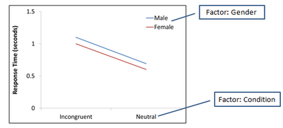
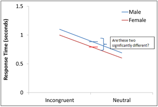
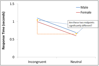
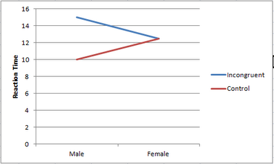
entirely cognitive and therefore has no behavioral correlate (e.g., instructing the subject to fantasize about Nutella), try to obtain a performance measure of your conditions, such as reaction time. Doing this will also reinforce the previous point, which is to plan out your experiment. For example, the difference in reaction time between conditions can provide an estimate of how many trials you may need during your scanning session, and also lead to stronger hypotheses about what regions might be driving this effect.

3) Have a processing stream already in place before the data starts rolling in. After running your first pilot subject, have a script that extracts the data and puts everything in a neat, orderly file hierarchy. For example, create separate directories for your timing data and for your raw imaging data.

4) As part of your processing stream, use clear, understandable labels for each new analysis that you do. Suffixes such as "Last", "Final", "Really_The_Last_One", and "Goodbye_Cruel_World", although optimistic, can obscure what analysis was done when, and for what reason. This will protect you from disorganization, the bane of any scanning experiment.

5) Analyze the hell out of your pilot scan. Be like psychopath federal agent Jack Bauer and relentlessly interrogate your subject. Was anything unclear? What did they think about the study, besides the fact that it was so boring and uncomfortable that instead of doing it again they would rather have a vasectomy with a weed-whipper? You may believe your study is the bomb, but unless the subject can actually do it, your study is about as useful as a grocery bag full of armpit hair.

6) Buy a new printer. Chicks dig guys with printers, especially printers that print photos.

Your ticket to paradise

7) Check the results of each step of your processing stream. After you've had some experience looking at brain images, you should have an intuition about what looks reasonable and what looks suspect. Knowing which step failed is critical for troubleshooting.

8) Know how to ask questions on the message boards. AFNI, SPM, and FSL all have excellent message boards and listservs that will quickly answer your questions. However, you should make your question clear, concise, and provide enough detail about everything you did until your analysis went catastrophically wrong. Moderators get pissed when questions are vague, whiny, or unclear.

9) When all else fails, blame the technicians. FMRI has been around for a while now, but the magnets are still extremely large and unwieldy, cost millions to build and maintain, and we still can't get around the temporal resolution-spatial resolution tradeoff. Clearly, the physicists have failed us.


These are just a few pointers to help you address some of the difficulties and problems that waylay you at every turn. Obviously there are other dragons to slay once you have collected a good sample size and need to plan your interpretation and possible follow-up analysis. However, devoting time to planning your experiment and running appropriate behavioral studies can go a long way toward mitigating the suffering and darkness that follows upon our unhappy trade.

Mine's Bigger: Connectivity Analysis Uses Sample Size of 439 Subjects


The next time you look at your dwindling scanning budget and realize you need to start coming in at 9:00pm on Fridays to pay a reduced scanning rate, just remember that there are other researchers out there who scan hundreds of subjects for a single study. (This isn't supposed to make you feel better; it's just a fact.)

A recent connectivity analysis by Dennis and colleagues recruited four hundred and thirty-nine subjects for a cross-sectional study to determine changes in connectivity from the ages of twelve to thirty. Overall, older participants showed decreasing long-range connectivity between regions, increased modularity (a measure of subdivision within regions), and hemispheric differences in global efficiency, consistent with developmental theories that short-range connections are pruned during adolescence while long-range connections are strengthened.

However, the observed hemispheric differences in global efficiency contrasted with previous findings:
Our results are contrary to those of Iturria-Medina et al. (2011), who found greater global efficiency in the right hemisphere, but these were from a relatively small sample of 11 subjects, and our sample is over 40 times larger. [Emphasis added.]

Boom. Over forty times larger, son. Sit the hell down. "But forty times eleven is four hundred forty." Yeah, well, the jury's still out on mathematics. "But we ran a well-controlled study!" WHAT PART OF FORTY TIMES LARGER DON'T YOU UNDERSTAND?!

Proof that size equals power can be found here.

FSL Tutorial 8: FAST

For countless aeons did neuroscientists burn with the perverse desire to segment human brains apart in vivo, while the juicy glands still pulsated with life within their unfortunate hosts. Numerous methods were attempted, as crude as they were unnatural - paint scrapers, lint rollers, zesters - but without success. And the neuroscientists did curse and they did rage and they did utter blasphemy of such wickedness as to make the ears of Satan himself bleed. With the terrible advent of FMRI did that all change; now, the tissue of the brain, the seat of consciousness, could be blasted apart while leaving its host intact; now could the grey be separated from the white, the gold from the dross. And then did the neuroscientists go down and slay the Canaanites, thirty thousand in number, and not a man survived as the neuroscientists did wade through swales of blood covered with the skins of their enemies and their eyes burned centroids of murder.

So goes the story of the creation of FAST. The tool is straightforward: Provide a skullstripped brain, decide how many tissue classes you wish to segment, and the rest of the defaults are usually fine. Often a researcher will want three tissue classes: White matter, grey matter, and cerebrospinal fluid (CSF). However, if you are dealing with a subject that presents with a brain abnormality, such as a lesion, you may want to increase the number of classes to four in order to segment the lesion into its own class.

FAST outputs a dataset for each tissue type. For example, if three tissue types have been segmented, there will be three output datasets, one corresponding to each tissue class; each dataset is a mask for each tissue type, and contains a fraction estimate at each voxel. The picture below shows a grey matter mask segmented with FAST. The intensity at the voxel centered at the crosshairs is 0.42, meaning that 42% of that voxel is estimated to be grey matter; presumably, the other 58% is white matter, as the voxel lies at the boundary between the head of the caudate nucleus (a grey matter structure), and the internal capsule (which is composed of white matter).


For some packages such as SPM, tissue masks can be used for normalization. For example, the grey matter and white matter masks will be normalized to mask templates in a standard space, such as MNI, and these warping parameters are then applied to the functional runs. However, the volume of these masks can also be calculated and compared across subjects or across groups. In order to calculate the total grey matter volume within a mask, for example, fslstats can be used:

fslstats s007a1001_brain_pve_1.nii.gz -M -V | awk '{ print $1 * $3 }'

This will return the volume of the mask in cubic millimeters; the same operation can be applied to the other masks by substituting s007a1001_brain_pve_1 with a different class (e.g., either 0 or 2).

However, for more sophisticated voxel-based morphometry comparing volumetric differences between focal cortical areas or specific subcortical structures, I recommend FreeSurfer. Brain segmentation is part of the default processing stream in FreeSurfer, and the volume of each area is output into a formatted table. This will be covered in a later tutorial; for now, use FAST and appreciate its bloody, violent history.